The esports market is oversaturated with troupes. Teams look directly to their traditional sports counter parts for inspiration.
This has resulted in a homogenised and stale visual landscape, washing the market in a sea of predictable stylistic choices.
In order to make impact, FNATIC needs to actively avoid these clichés to truly stand out as a market influencer pushing the definition of esports, and by proxy it’s partnerships,
into the future.
into the future.
Visual exploration centred around three keywords that encapsulate the
FNATIC x Freeletics partnership: journey, movement and energy.
FNATIC x Freeletics partnership: journey, movement and energy.
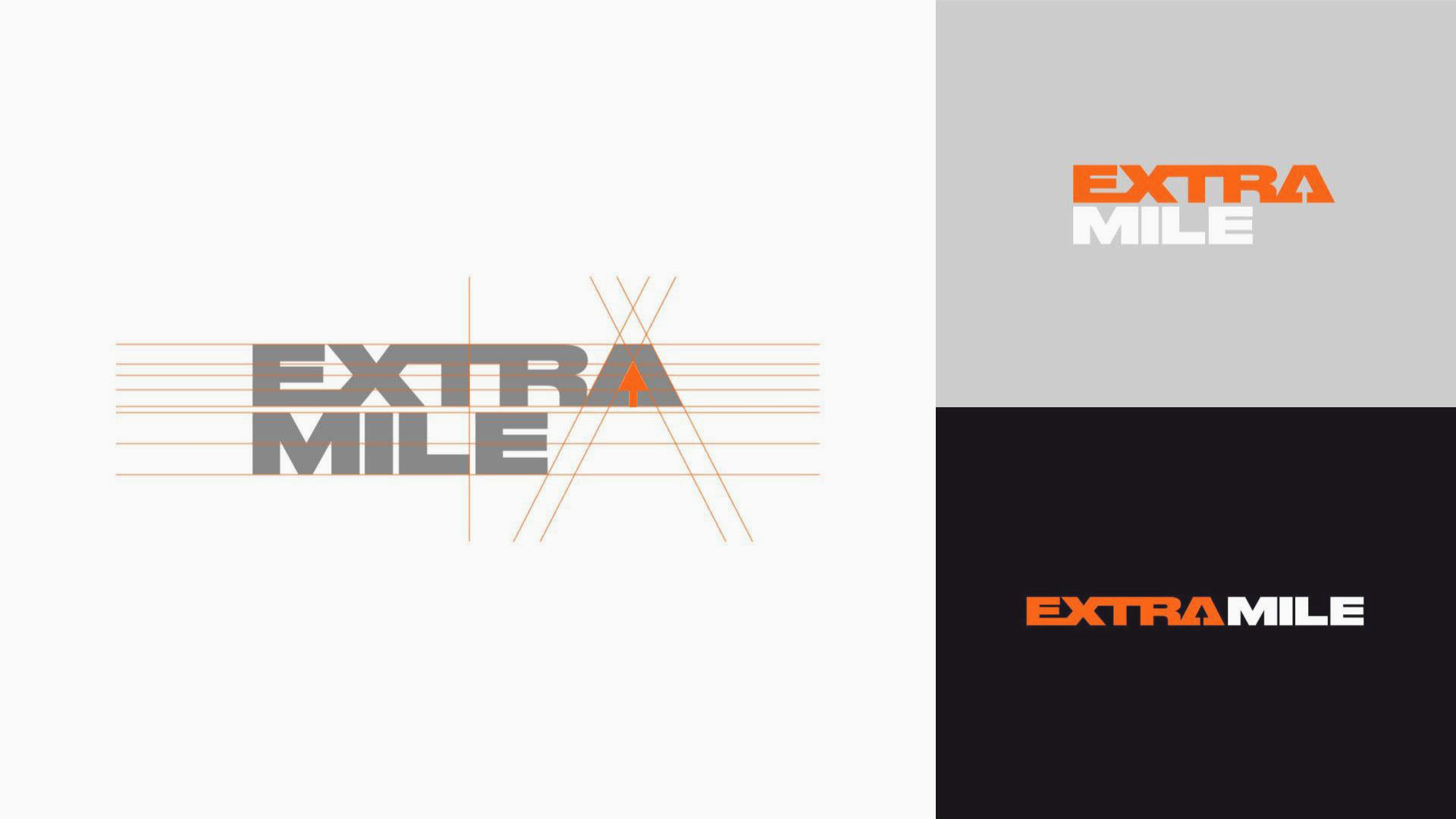
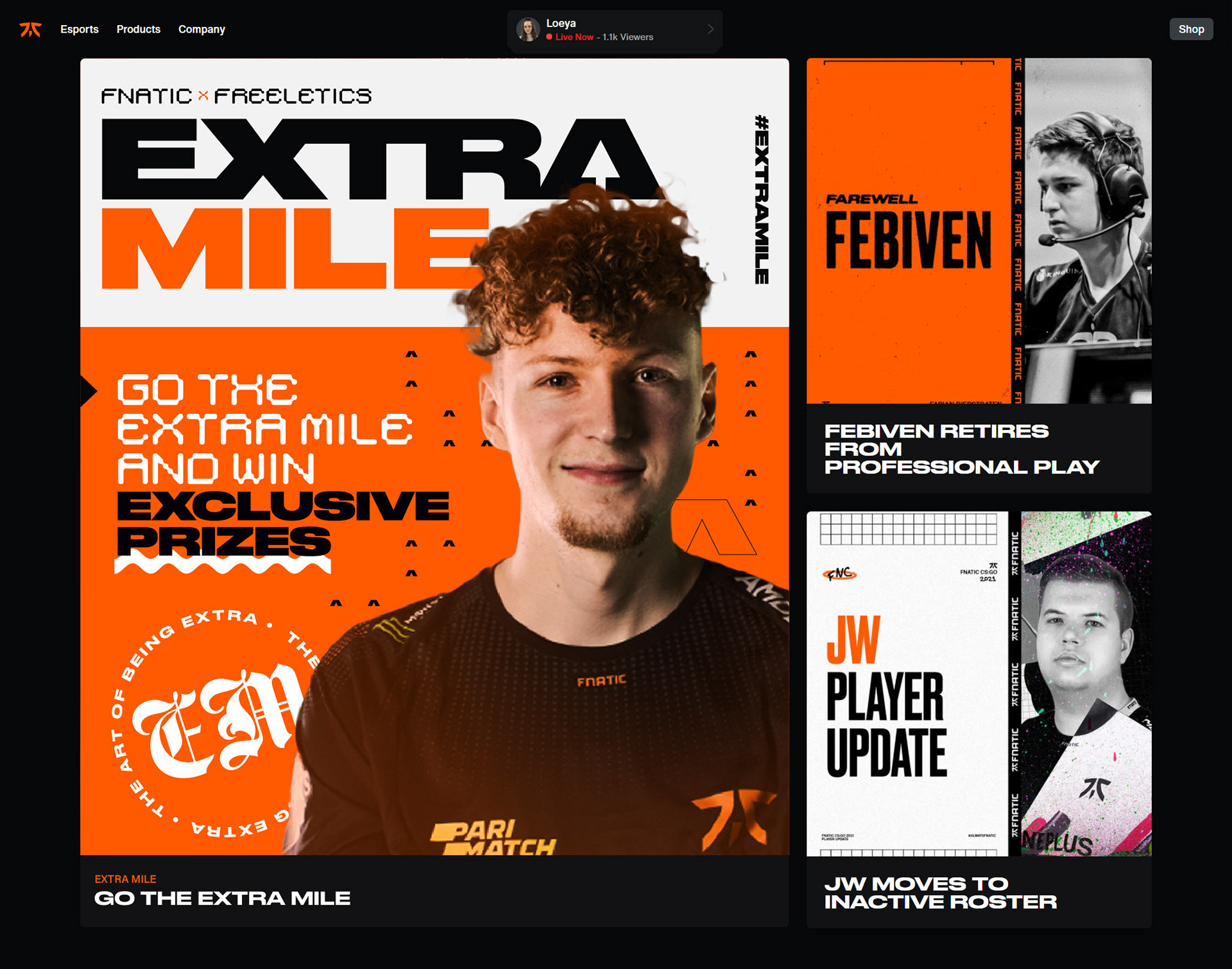
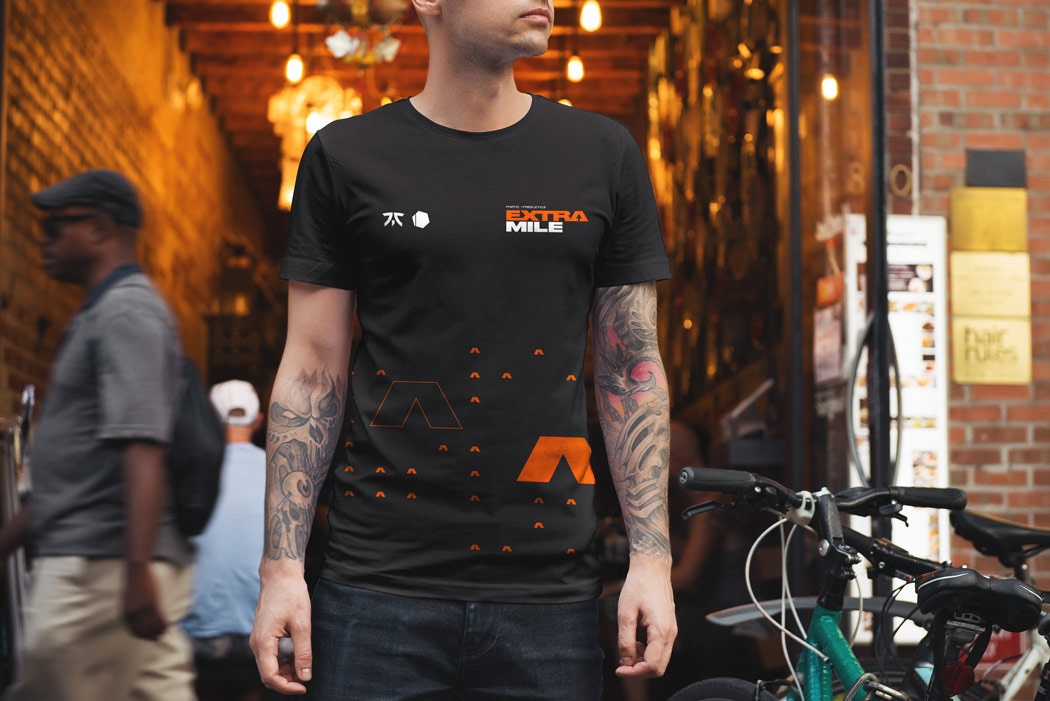
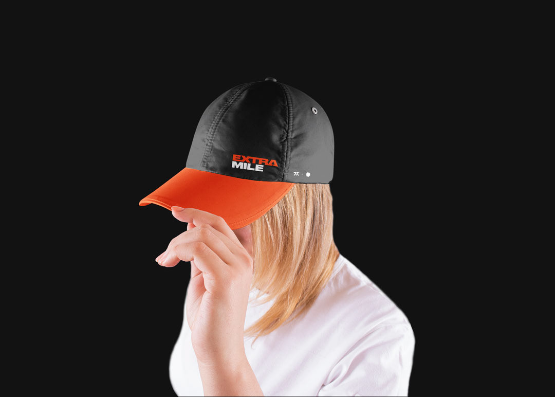
The key concept tying together the visual language is the idea of movement. From the articulation of a GUI pointer seen in the logo, though to abstractions seen in print design, arrows are the perfect expression of movement and tie the visual language together.
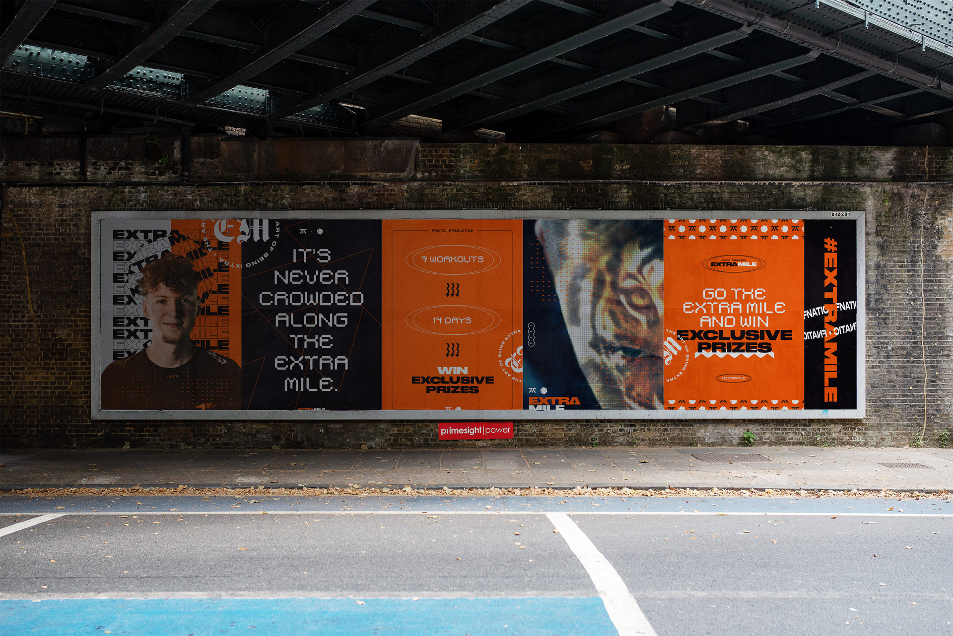
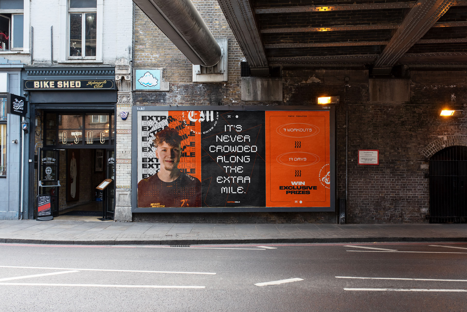
Strong visual assets play against bold typography and enable a variety of contrasting compositions to play against one another.
The resulting design system is completely responsive, versatile brand that can be applied across any medium from OOH though to digital, motion to merch.

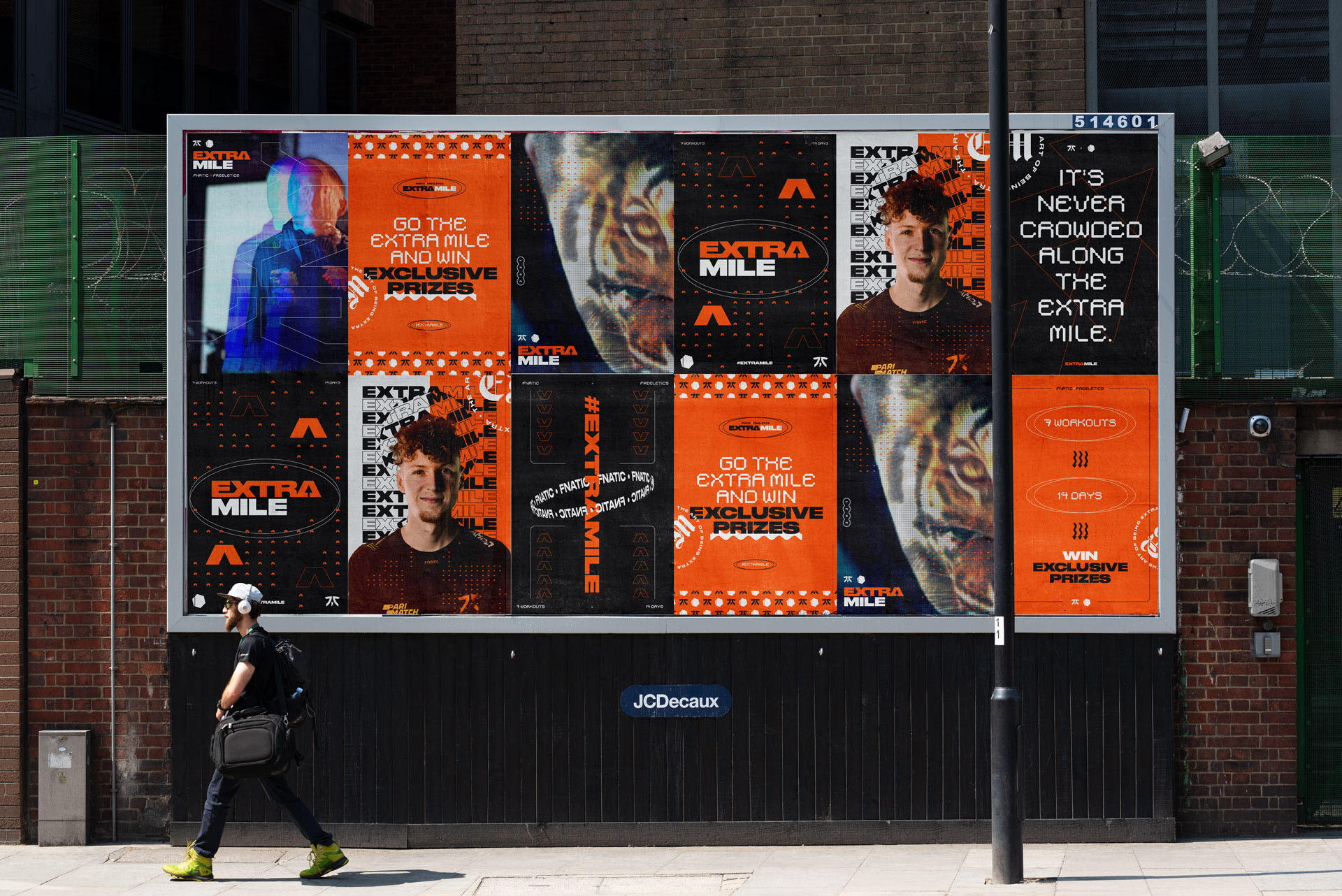
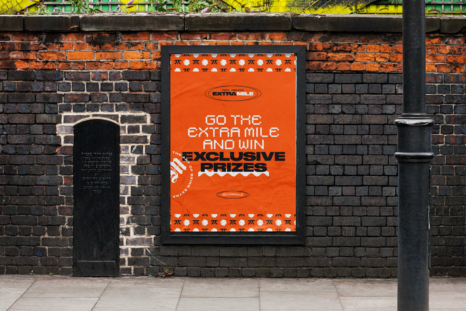
To drive campaign awareness, responsive print designs were developed for numerous layouts across billboards or to also be used individually.
Due to time constraints a vector typographic route was taken for ease of art working, inspired by FNATIC’s existing identity, grunge, gen z visual culture and editorial magazine design.
These could be further developed to enable AR functionality, adopting motion assets into the real world.